TeamKids Superheroes
September 2018 - March 2019
User Experience Researcher & Designer
Overview
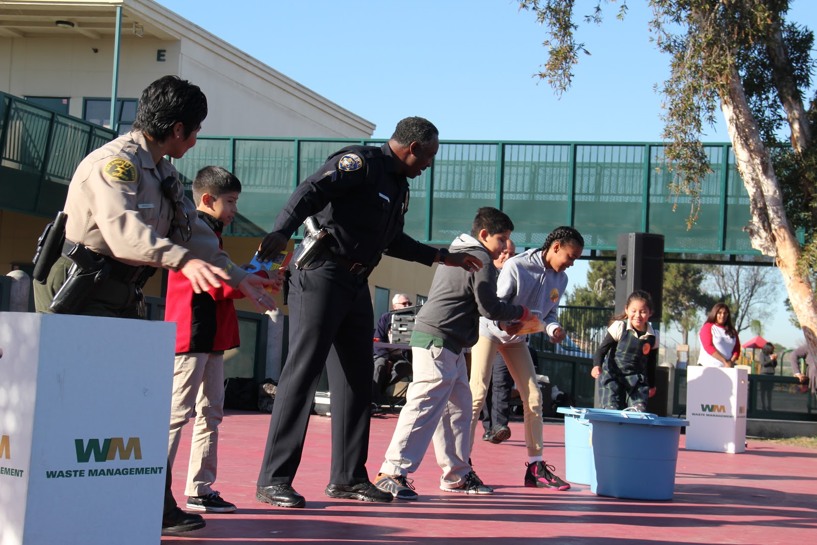
TeamKids is a non-profit organization geared towards empowering young children to change the world. Through specially curated activities, children have the opprotunity to engage with their broader community, enact change, and take one bold step to make a difference.
Problem
TeamKids reached out asking if we would like to create a more concise and detailed website centered around the Team Kids Challenge. This website, Team Kids Superheroes, would allow kids in schools not touched by the organization to experience the same lessons and feelings of empowerment as the current Team Kids affiliated schools. These new kids will work to complete service missions with their parents and earn bus stickers for each completed mission online. As you will see, we were able to accomplish their vision of empowering kids everywhere!
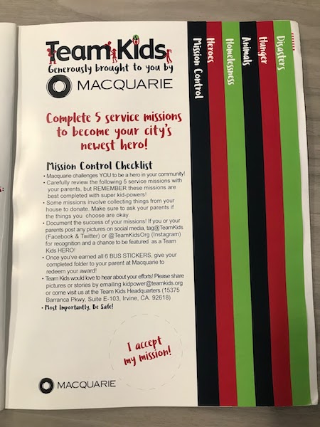
TeamKids Superhero Booklet
Assumptions
Below are a list of assumptions our team made prior to the development of the TeamKids Superheroes webpage.
-
Users have access to a computer.
-
User has a novice understanding of how to use a computer and an email account.
-
A users’ parent/guardian has an email account.
-
Users have a basic understanding of how to navigate through a website or has a parent/guardian who has basic understanding of how to navigate a website
-
User has access to a car, train or some mode of transportation to complete the mission’s that require transportation.
-
Users know how to take a picture (either with a camera or on a phone) or has a parent/ guardian that can take a picture for them.
-
Users can type or has a parent/guardian that can type on a computer or laptop
Use-Case and UML Diagrams
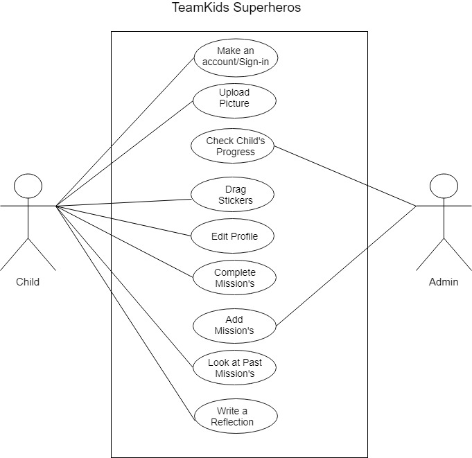
Use-Case Diagram
.jpg)
UML Diagram
Sketches
These were sketches for the mission page we planned on implementing for the website. The first incorporated a section where we imagined a picture of the child to potentially go; however, after multiple discussions we decided on the latter iteration. This was an instrumental group session where we decided on which rough design to move forward with. This ultimately served as the foundation for our low and high-fidelity mockups and our website as a whole.
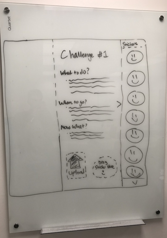
Mission Page: Rough Iteration

Mission Page: Final Iteration
Personas & Scenarios
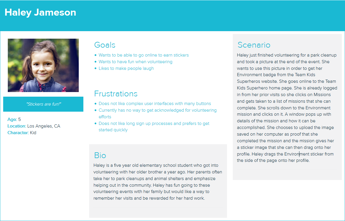
Haley Jameson

Jacob Smith
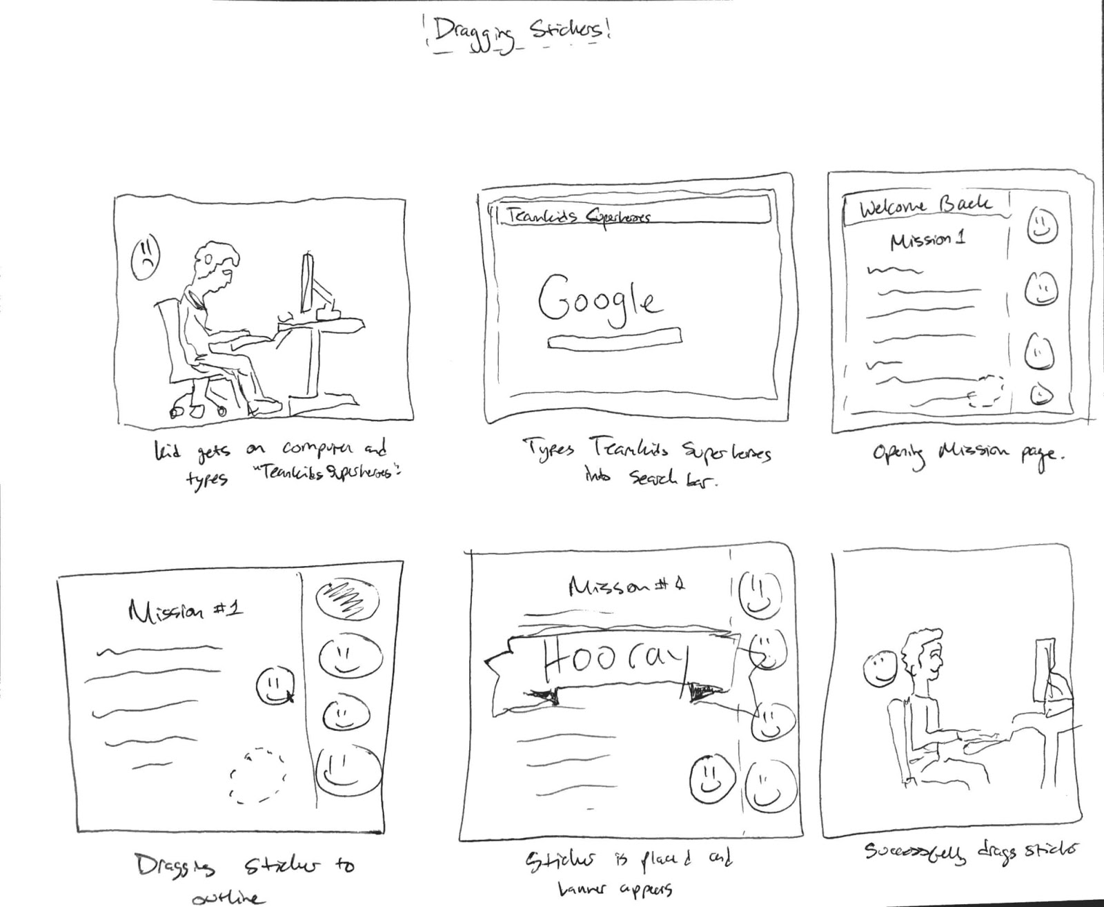
Storyboards
This was another research technique we used to garner a more holistic understanding of the product we wanted to develop. It allowed us to understand what was happening in the world of the children, what potential challenges they would face, and the course of a mission from start to finish.

High-Fedelity Mockups
- Log-in Page:
When creating the Login page, we dabbled with the idea of making the layout fun and exciting because Team Kids Superheroes is a kids website. However, making it more simple makes getting started easier because there is no visual clutter. Kids can wait until after logging in until the website becomes more interesting. Parents with very young children would also have to help them makes accounts and it would be beneficial to them to have a familiar login layout for the very first time.
- Profile:
The profile is fairly simplistic. It only includes the name, general location, email, and gender of the user. The profile picture is going to be a stock image that the child selects from a variety of images. This is to protect the privacy of the child and not unnecessarily include any of their personal information. We wanted to include the stickers that the child earns from completing their missions on the profile and will possibly include a sidebar on the right side of the page like in the second image below.
- Signup Page:
We wanted to get a broad area of the user’s location so that local challenges could be directed to the users. Other designs with the address and zip code were considered, but ultimately we decided that an exact address can potentially compromise the child’s privacy and with no reason because our goals did not need a precise location to work. This way, Team Kids is able to send children local challenges for them to complete and the child’s home address is not needlessly given. This layout is streamlined and straightforward to keep consistency with the login page. We have all the information centered in the middle of the screen with plenty of whitespace on the sides to present the content in a professional and intuitive manner. Some of our concerns were that the website looks a little plain this way, but we might be able to have Team Kids commission some assets or procure images that we can use to decorate the side.
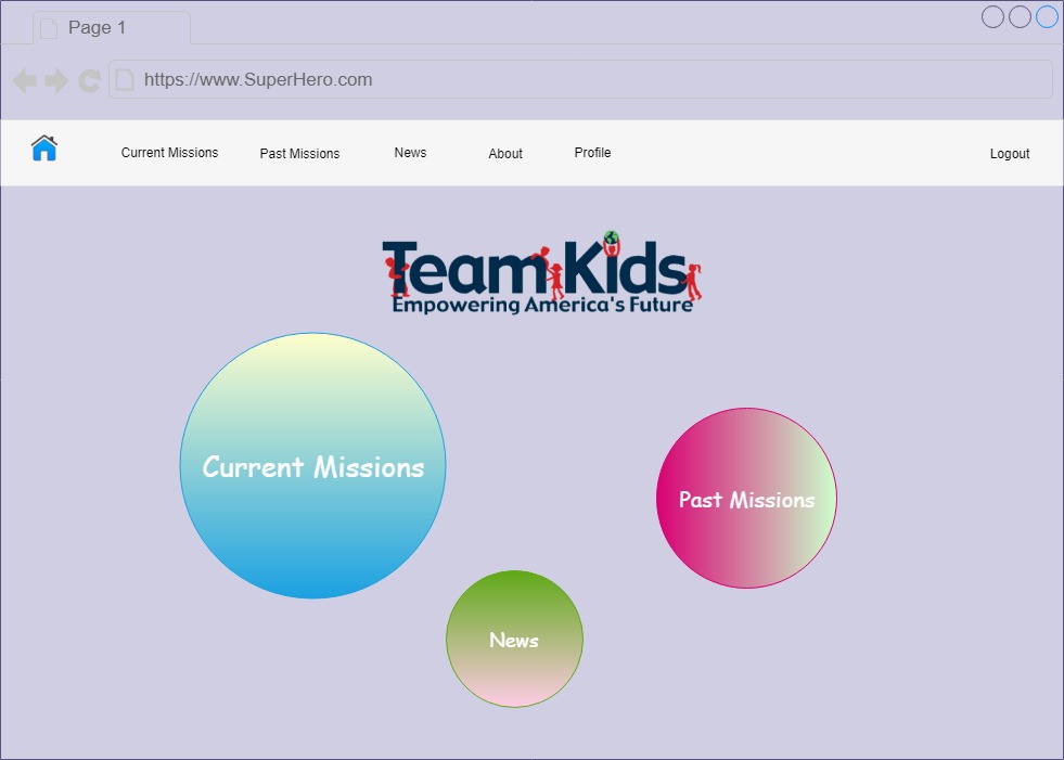
- Homepage:
Once we get to the Home page, the design begins to be more fun and interactive. We want to make sure the buttons are big and easily capture a kid’s attention. The bubbles will highlight when they get hovered over and grow bigger to be flashy and exciting. This page contrasts the login page by not being as clean and efficient. We wanted to make the home page easy to navigate for children and fun at the same time. This is accomplished by not having many icons on the home page, but they are big and colorful which makes them easy to spot. The Team Kids logo is included here as a placeholder, but the Team Kids Superheroes site will have its own logo to constantly reinforce to users what website they are on.
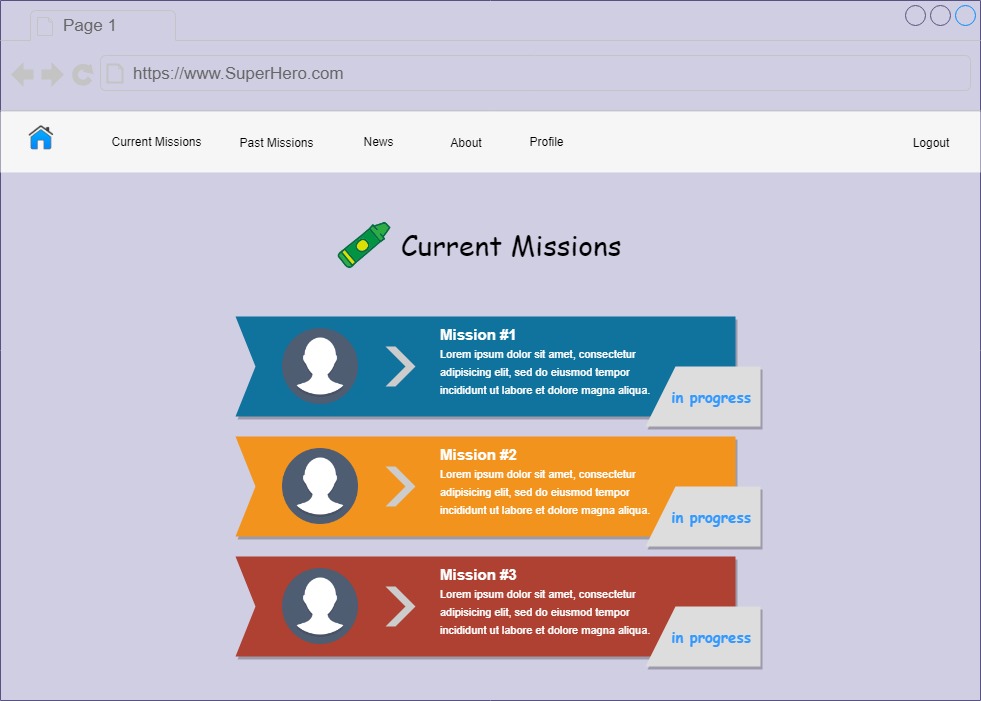
- Current Missions:
The Current Missions page shows the active missions to accomplish in the area. Each missions is listed row by row, which is intuitive and easy to follow. We use the Team Kids colors in order to make the missions pop out more on the page. Each mission could have been added as circles much like the home page, but we decided against it because the circles are what makes the home page stand out from the rest of the pages. Here the missions are shown in a more clean design layout and more systematically. We can add a scroll wheel that goes down when more missions are added as opposed to making a bunch of circles in random locations, which can get cluttered and unintuitive very quickly.
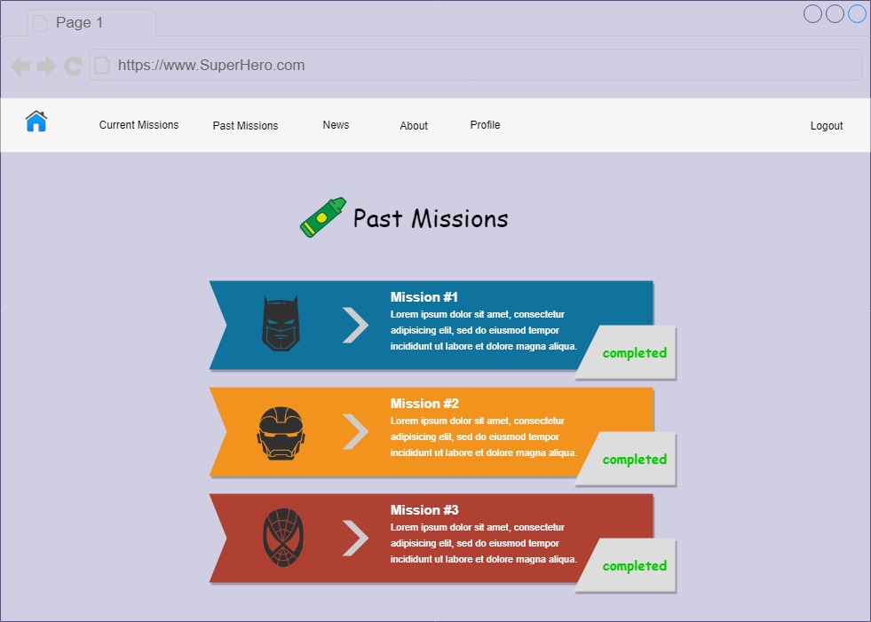
- Past Missions:
The past missions page lists all the previous missions that the child has completed. In addition to the status displayed on the right, there is also a sticker that is associated with the mission. Clicking one of the missions will take the user to that specific mission.
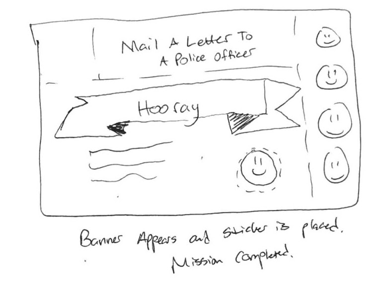
- Sample Mission Page, Writeup, and Dragging Stickers:
The mission page contains details around speicific missions and explains the requirements in order to complete them. Children can upload an image(optional) about their progress on the mission. Additionally, children are required to write a reflection by clicking “Write an Reflection” before he/she can drag a sticker. Dragging a sticker to outlined box will complete the mission. The second image is an example of a user writing a reflection about their experience, and the third is a mockup of how to drag a sticker to complete the mission.
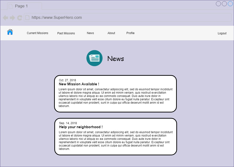
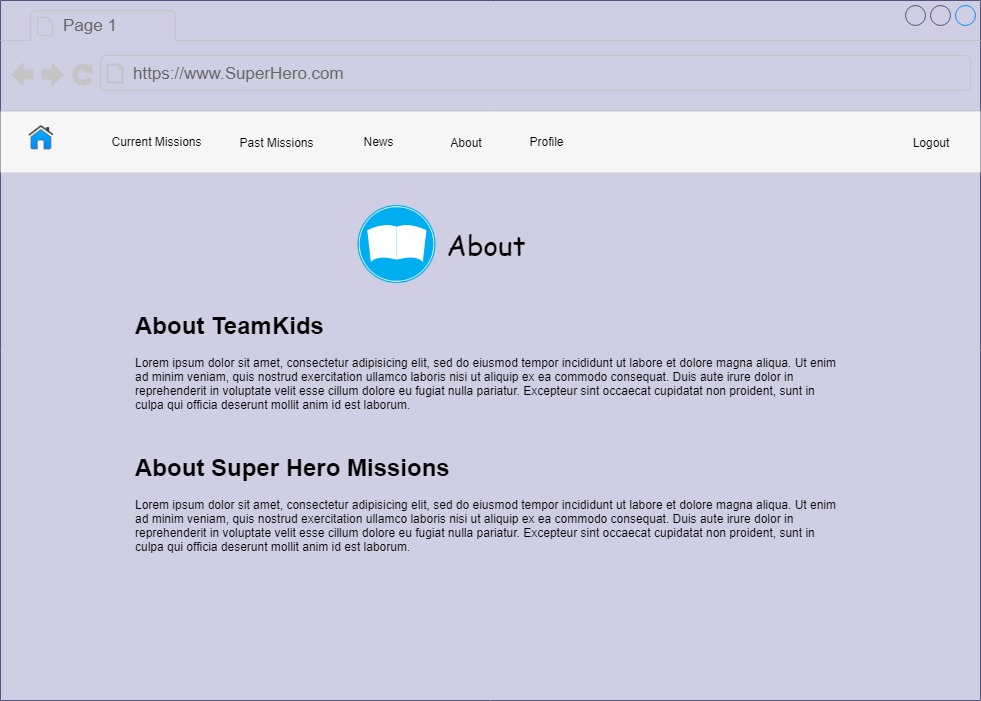
- News and About Pages:
The first image is integral for all children as it serves as an announcement page. It will contain all the messages the administrator would post--including new missions. The second mockup is the about page of the website that details the vision and mission of TeamKids.


Conclusion
In a span of 20 weeks, the team was able to create a full scale website that enabled children across the world to partake in various missions and challenges in their respective communities. Our research, sketches, personas, prototypes, and mock-ups all contributed to the resulting product. Proud to have been part of the Teamkids family, an organization empowering children one child at a time.
Words: Maaz Munir
Website